Whatever Strikes my Fancy.
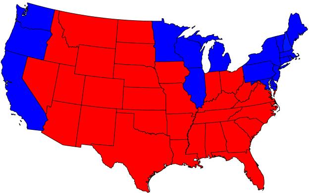
The state-by-state map we have all seen a million times. Republican supporters like the look of this one because of the vast amount of red (Republican) vs. Blue (Democrat). It gives the impression that the Republicans, ergo Bush, are much more popular than they really are.
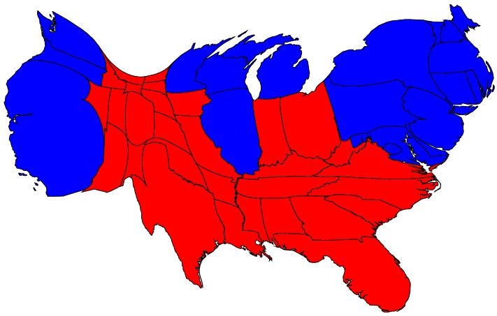
Democratic supporters like to counter with this cartogram, or something similar, that shows the states altered in size to represent their weight in electoral college votes. Alaska and Hawaii are missing, in terms of the first real-area map of course Alaska is very large and Hawaii is very small. In a weighted cartogram like this one Alaska is very small and Hawaii is rather large.
|
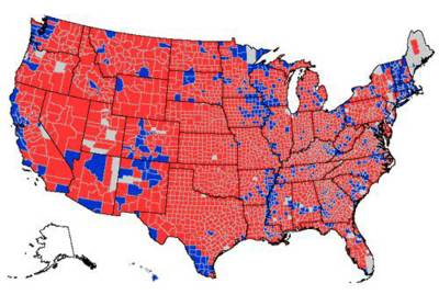
The Republican supporters are even more fond of this county-by-county breakdown since it very much gives the impression that the vast majority of Americans support Bush and the Republicans.
|

This cartogram, rather rarely seen in my experience, has the counties weighted by population. Once again we see a truer representation of the close to 50/50 split.
|
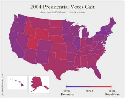
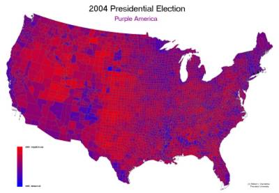
The whole process becomes more interesting when not looked at in terms of strictly black and white (or blue and red in this case). Here we see the state map with each state shaded purple based on the number of votes cast for blue (Democrat) or red (Republican). Moderates like this map best of all, the colouration is surprisingly even when looked at on the state level with no bright blues or reds.
|
Drilling down to the county level it's again apparent that Democratic support is directly related to population density. At this level it once again looks like looks like there is majority support for the Republicans, but weighting for population...
|
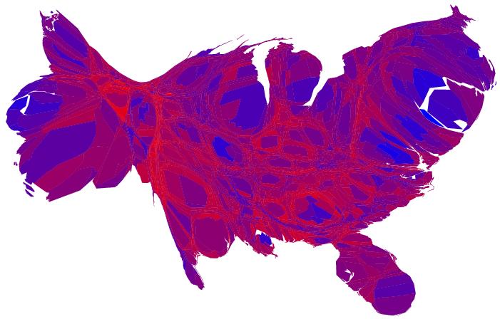
Here we have the truest map of the American political landscape. Here the shades of purple are broken down by county and the counties are weighted by population. Note the large areas of bright blue in San Francisco, New York city, Philadelphia, St. Louis, Washington, Atlanta, and New Orleans. Seattle, Portland, Los Angeles, Miami, and Chicago are not as brightly blue, but still notably so. The bright red areas are relatively small and rural, and most areas are a nearly 50/50 shade of purple. Make of it what you will. My interpretation is that those areas with the most access to a wealth of alternative media sources made a more informed decision and chose the lesser of the two evils.
|
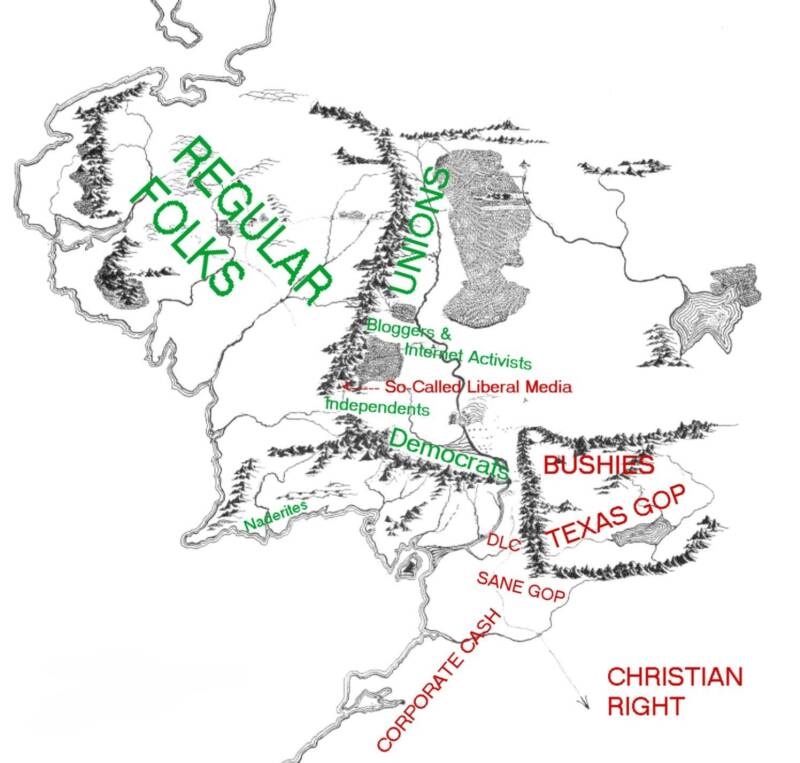
And finally, there is the political map, which is just damn funny ;-)
|
Oringinal post: http://mbarrick.livejournal.com/608804.html