Photography, History and Whatever Else Strikes my Fancy.
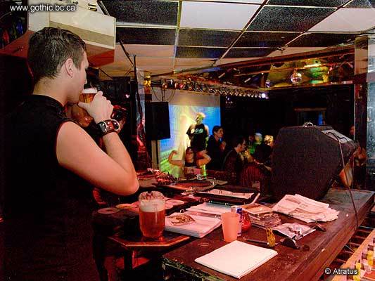
Regardless, I made some interesting images Thursday night, experimenting with the new flash in a new space.

| I'm really enjoying the ability to fill with some indirect light without overpowering the ambient light, not to mention staying away from the red-eye you get trying to take pictures of people in the dark with a direct flash. |
Last Sunday at the Red Room was my first attempt at making night-club images with all the new gear and I definitely improved on those efforts. I'm still not as comfortable with the new gear as I was with the old camera, but it is coming.
And speaking of the old camera, my replacement part for the bit I buggered up during the disassambly should be showing up any day now. I just learned that exposed colour negative film is transparent to infra-red and experimented a bit with using a chunk of exposed colour negative as a visible-light filter on my newly IR-capable camera. It worked really well (other than the fact that the flash is now stuck on and until the replacement part arrives to get the appropriate button working again). I'll have to McGyver-up some way to attach this home-made filter to the camera.
So, crippled as I was by the tendonitis flare-up, I put a second mouse on my computer for left-handed use (my usual ergonomic mouse is designed for right-handed use only) and set about to getting the new dynamic design I was playing with some weeks back finished to the point where I could start applying it to http://www.mbarrick.net.
The new design looks very simple and clean, and it is simple for me to maintain, but to get that "simplicity" took some complexity that simply doesn't show. One part of the complexity (visible in the source code) is that the design is wholly dynamic. None of this "Best viewed at X by Y while standing on one foot and holding a coat-hanger covered in tin-foil at 37.5° facing NNW" shite. This is something that has always (since the days of Mosaic 1.0) bugged me about most web designers: a browser is not a piece of paper. As a designer you have to account for the fact that the "surface" you are working with can and will change in size. The other interplay of simplicity and complexity is in the menu. I looked at pre-written code for several drop-down style menus and without fail found the code involved to be needlessly complex. So, as I find is often the case, it was easier and more efficent to write something of my own from scratch. Admittedly what I have is a solution tailored for this design and not a configurable system like those I looked at, but still, mine uses one simple JavaScript function 13 lines long, tested on MSIE 5+ and Gecko 2004+ browsers on Windows and Linux. It degrades gracefully on older browsers, and even works acceptably with text-only and WAP browsers. Based on my own logs, I've got 100% of my audience covered. The menu content is built server-side using Lotus Notes formula language in the database that drives the site.
I've still got to move a bunch of old content over (especially my portfolio) and put together a style for my LJ that more closely matches what I have done with the embedded entries visible via the new website. Obviously without being able to use JavaScript I'll have to make some concessions with the LJ design. Portfolio first, though.
Oringinal post: http://mbarrick.livejournal.com/628231.html